

Yoga Studio


: Spotting a digital opportunity !
I’ve been practicing yoga with Dr. Madhuri Rozal for two years and noticed her challenges with marketing and branding. Wanting to support small businesses, I pitched the idea of building her a website. To bring it to life, I also onboarded a UX designer through the Hexagon UX Slack community.
Overview
My Role
UX Designer
Stakeholder Mapping
Duration
15 Weeks
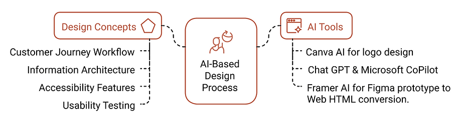
Methods & Approach
Market Research, User Research, UX Information Architecture, UI Design, Stakeholder Mapping, Persona Building, Wireframing, Prototyping, AI Driven Design Process and User Testing

Zooming in on the Mission and Constrainsts
Design an engaging website to convert new visitors into new clients for Dr.Madhuri Rozal’s live online yoga classes.
Mission
Research user motivations and concerns to craft a credible, appealing site that builds trust and expands her online reach.
Constraints
Limited budget
Stakeholder new to digital experience, not well versed
Fast delivery timeline
Develop from scratch and deliver a fully functional website published within 4 months.
Final Design Impact

60% increase in sign-ups

100% resolution of customer communication issues

Established strong, credible online presence
Concepts Explored
Solution
I designed a website that reflects the essence of Dr. Madhuri Rozal’s yoga practice and values.
It simplifies navigation, ensures brand cohesion, and clearly communicates class details and benefits.
The site bridges knowledge gaps for beginners while building trust with potential clients.
Overall, it establishes a warm and credible online presence that supports class conversions.

Prototype Link
Research and Analysis
Crafting the Look and Feel

Listening to the Market
“To better understand how yoga is currently experienced online, we explored both mainstream platforms and niche practitioners. Our goal? To identify what works, what’s missing, and how we can better serve our own community.”


Key Insight
One significant takeaway was the importance of providing users with the ability to select their preferred yoga style and guiding them seamlessly to the class that aligns with their specific needs, ensuring an effortless and personalized experience.
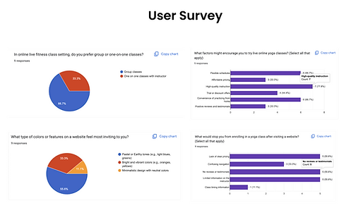
User Research
To better understand our users, we designed a comprehensive survey informed by initial research findings. This allowed us to explore their demographics, fitness routines, yoga preferences, motivations, and pain points. By uncovering their expectations and goals, we gained valuable insights to shape a more engaging and user-focused online yoga platform.

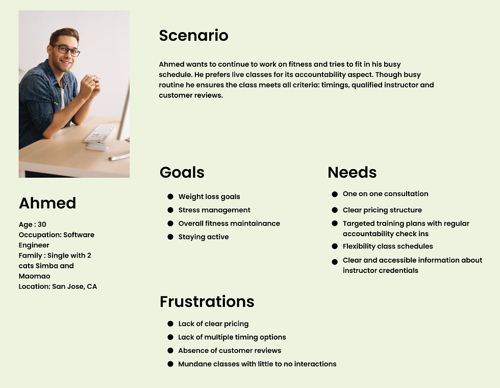
Everyday MVPs
Using insights from the Survey and user Interviews I crafted three personas using clustering techniques to lay out a holistic picture of our user groups and their needs to guide design decisions.

Information Architecture
I built an information architecture to understand and map a clear path as users flow through content toward their goals.

A/B testing
We ran a test with two wireframe options, both built on the same Information Architecture. We wanted to know which layout felt easier and smoother for users to navigate. The feedback gave us clear answers and helped us pick the design that made the most sense. In the end, we wanted to make sure the site worked seamlessly for everyone. We built both desktop and mobile wireframes and tested for both.

Usability Testing
After developing the hi-fi prototype, I tested it with 10 users out of which 8 were new clients. I designed 3 scenarios each targeting a persona to gain more insights on how usability impacted their journey and to understand their overall experience with the site.

A Glimpse of Design Solutions


I conducted another round of usability testing where the prototype was tested with the selected 3 tasks from before. These tasks focused on navigation, booking free trial, booking consultation, Signing up for class, marking absent, setting up autopay.

Final Thoughts
This project taught me how to navigate tight constraints around budget, time, limited information, and initially unclear requirements. It was a valuable experience in resourcefulness reaching out to friends and community platforms helped us gather a lot of meaningful feedback that shaped the design process.
Future Work
Since many users are based in India, including people over 50 who prefer Hindi, I plan to use Smartcat to translate the website into Hindi, making it accessible in both Hindi and English.
